The landing page plays a fundamental role in turning browsing into purchasing, therefore when crafting a landing page, marketers should ensure that they are putting their best foot forward via compelling content and calls to action, with the customer experience at the forefront of mind.
There are no set rules regarding the design of an ecommerce landing page, but it should be consistent with the marketing campaign that helped attract the customer to the website. The consumers were attracted to the advert, email or social post for a reason, and the page that they are directed to should look and feel like a natural progression of that journey. Marketizator states that,
The page should have a clear structure, which is easy to navigate around, and a clear progression path should they wish to take action.
How to maximise your conversion rates:
Simple headline
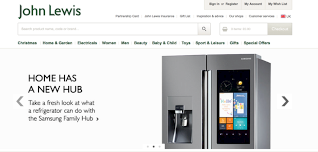
As an extension of the initial outreach campaign, you have already done the hard work and funnelled your visitors to a place of transactions. Kissmetrics says that marketers now need to convince users “to pull up their chairs and stay awhile.” Marketers need to be aware that they only have a customer’s attention for a couple of seconds when they hit a landing page, and it is therefore important that they make it count.
Product information
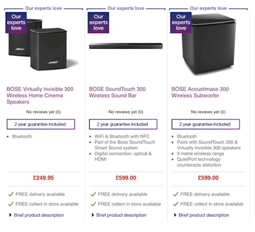
It is likely that a customer has arrived on your landing page because of intrigue or interest. Marketers must now ensure that the content the user is presented with does everything to eliminate any confusion with regards to the offering. Without being patronising, it is advised to assume that you are speaking to an audience that knows nothing about what you do, what you are selling, and how they can get involved.
As a marketer it is likely that you live and breathe your campaigns and business offerings, and therefore it is a good idea to get the feedback and opinions from your customers.
Call-to-action
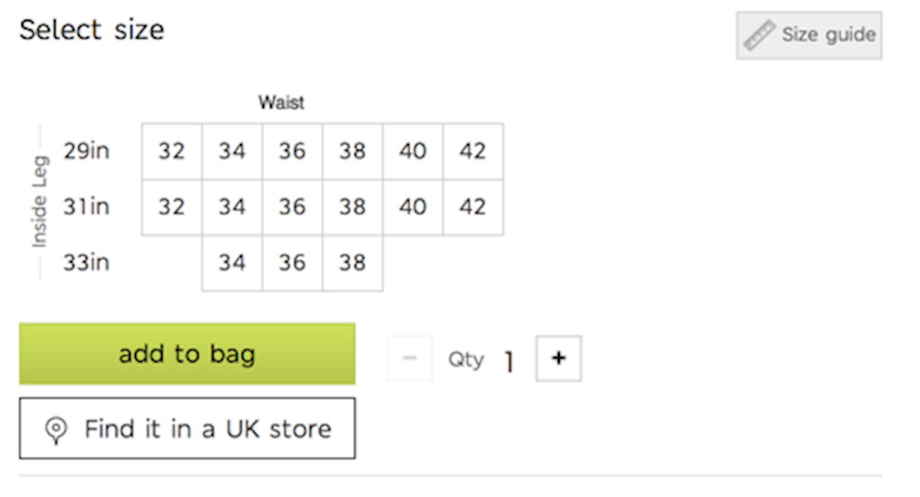
By definition a call to action should encourage just that; an action. Ensure that it is not buried within a large block of text. Special care and attention should be given to font size, color and position. It is advisable to test subtle changes and tweaks, or even run two landing pages simultaneously and analyse the results – this is split testing in its simplest form.
Split testing can of course go considerably further, and as a result of testing, online retail giant Amazon have changed their CTA based on geography in order to “adhere to the local flavor,” states VWO.
Imagery
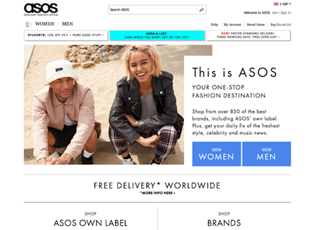
The power of imagery on your landing page should never be underestimated, after all, the brain processes images 60,000 times faster than text, with research from MIT finding that the human brain can process entire images that the eye has seen for as little as 13 milliseconds. Therefore, visitors will consume your images before they have even had a chance to read your words, so utilize imagery wherever relevant on your landing page and grab the attention of the customer before they even have the chance to read the description.
Cross-selling

In 2006, Amazon reported that cross-selling and upselling contributed as much as 35% of their revenue. By making complimentary suggestions or recommendations to the customer, based on their selections, you are bringing other useful products to their attention and potentially increasing the chances of conversion.
Value proposition and testimonials
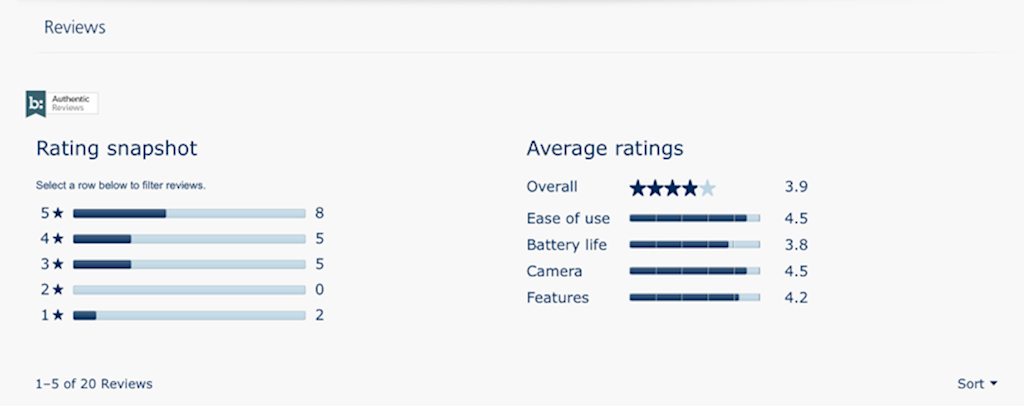
To successfully convert, you need people to choose to purchase the product from your company instead of looking elsewhere. They want to buy from a company they can trust and use again in the future. By placing a testimonials tab on your landing page, customers will be able to read about the positive experiences of other customers, making the business more trustworthy. Also, adding value propositions such as free shipping will incentivize customers to choose your service.
These are just a few techniques that can be adopted for a company landing page to help convert customers to buyers. However, company objectives and websites differ in design and purpose so continual testing is important. To ensure that the systems used on the landing page are successful in converting, keep adapting and testing until the desired conversion rates are met.
Access the latest business knowledge in Marketing
Get Access


![13 Psychological Pricing Tricks You Should Try [Infographic]](/getmedia/1577a674-5aec-40dc-b038-83209d78567b/psychological-pricing-tricks-you-should-try.jpg?maxsidesize=350&resizemode=force)

Comments
Join the conversation...