Understanding more about your users is the most effective way to make marketing campaigns as engaging as possible. There are many ways that marketers can gain insight on the people interacting with their brand. From social media listening to directly gathering information from users via online forms, a number of strategies can get meaningful data that can be used to influence future campaigns.
But what about heat maps? By tracking where users move on the page, marketers can see where the best place is to position crucial CTAs or even links to other parts of the website. But the system has received a lot of criticism for being more of a vanity metric than anything substantial.
However, there are some legitimate ways that heat maps can help you improve your marketing strategy:
1. Heat maps can optimize your online content
Content is at the heart of all digital marketing and though many strategies have evolved to branch out into other areas, it remains an important part of a brand's website and without it, SEO is virtually impossible.
Studies have shown that longer content is more likely to engage an audience, while also producing higher search rankings. But this doesn't necessarily mean that you can bash out 1,890 words and be done.
A heat map will tell you when readers are losing interest in your content or veering off to other parts of the webpage. This should help you understand not only what the optimal length to write is, but how different topics engage your audience. For example, readers may be happy to read 1,500+ words on a very niche or specific subject that your brand can uniquely deliver on, but only want to read less than 300 words on your 'About Us' page.
There's no one-size-fits-all rule for finding engaging content every time, but heat maps can show you how to optimize content to your specific target audience.
2. Improving your page structure
Much like content length, there's no foolproof way of finding the optimal page structure. Heat maps can help you experiment with different page layouts, elements and strategies. This means you can trial putting CTAs, for instance, in different locations around the page and see which proves to be the most effective using heat map technology.
There's also research to suggest that the balance of text and images can have an impact on how readable content is to an audience. Experimenting with different versions of a page layout and structure can allow marketers to see where best to place videos, images, downloads and even internal links to get the best results.
3. Heat mapping is accessible
The nature of analytics software can mean that many professionals, even experienced marketers, can feel lost when it comes to fishing through large quantities of numbers and percentages. This can make it extremely difficult to draw any meaningful conclusions from Google Analytics or any other data-based software and even harder to implement effective changes.
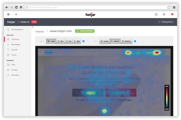
Heat maps allow people to quickly and clearly see when readers are losing interest and where they are most likely to click elements. Dead zones that are getting hardly any activity come up bright blue, allowing everyone to see what areas are being ignored by users.

Source Hotjar
This opens teams up to debates about how the page structure could be improve to get more interaction or whether the site can be altered to make better use of all the space. Heat mapping makes it easy for cross-team collaboration too, allowing everyone to be involved in discussions around site optimization with just a minute or two's explanation of the system.
4. Heat maps unlock data
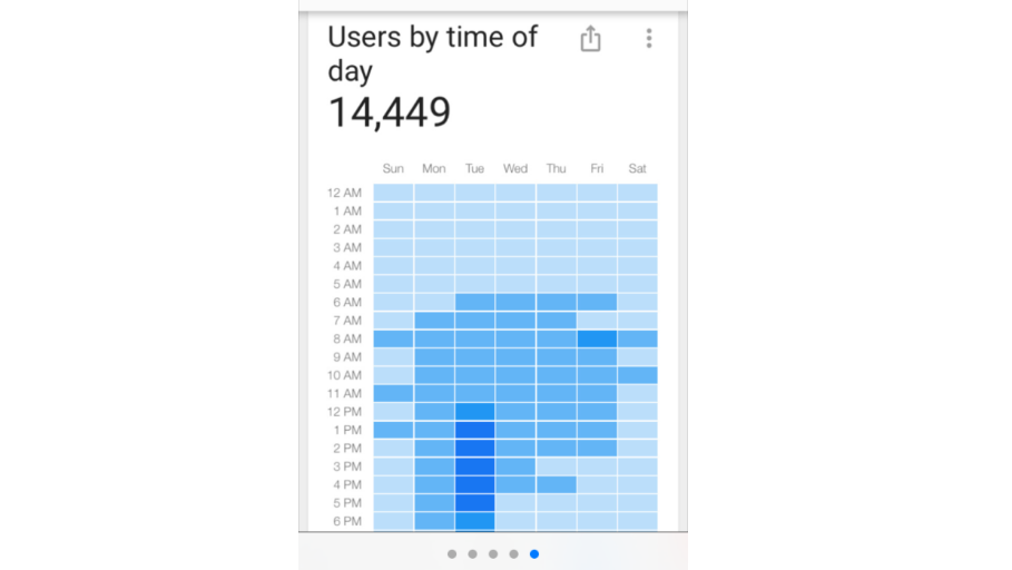
Heat maps can be used hand-in-hand with analytics data. It allows you to quickly and clearly see trends in page views, visitor numbers, bounce rate and other user information in a much more accessible way. It helps prevent people getting bogged down in the nitty gritty of Google Analytics or debating a percentage point difference and instead can focus on the larger trends and activity.
Source Seers
Using heat mapping alongside analytics data allows marketers to see when is the most popular time of day to post content or what the average page duration is. This gives teams a strong starting point to better understand why certain patterns are happening and how they can make the most of them.
5. Understanding user behavior with heat maps
Movement maps can be a key part of using heat mapping to understand how users are behaving on a webpage or blog post. Along with other analytics information, you can get a much better picture of why traffic is coming to your website and what they're thinking when they land there.
Using movement maps can help you to see where on a page users are being drawn to, which can help with placement of key elements or brand logos, for example. This element of heat mapping can influence further marketing campaigns, with content being designed around the user behavior highlighted in the heat maps.
6. Uncover hidden problems
If you're completely at a loss as to why users aren't clicking on a certain element or aren't embracing your new web page design, heat mapping can help uncover your problem. By looking at the various elements of heat maps, you can try to understand what may be causing the issue. Even if you can't pinpoint the precise problem, heat maps can allow you to see how changing various elements can influence engagement without having to wait until the end of a campaign.
Access the latest business knowledge in Marketing
Get Access


Comments
Join the conversation...