Content marketing strategies are built around creating content that your audience will find engaging, interesting or entertaining, but what do you do about the stuff that is just plain boring?
Whether it's product description pages, About Us landing pages or in-depth whitepapers, some content is simply dry. But just because the topic is less-than-fun doesn't mean you can't make it look impressive and engaging.
Here are some of the best ways to make boring content fun:
1. Quizzes
Thanks to the increasing popularity of sites like BuzzFeed, interactive quizzes are an engaging way to present even the dullest of topics.
Like this example from AMMEX, which encourages users to find out 'What type of disposable glove you are', the subject matter doesn't always matter. Its tongue-in-cheek approach to interactive quizzes sees visitors answer a selection of unrelated questions to find out what product they are. Of course, the result doesn't matter but the quiz requires people to input their contact details to find out the answer.
Other brands, such as Topshop and AirBnB, use interactive quizzes to help users through the buyer cycle. Instead of allowing visitors to aimlessly browse their sites or dull product descriptions, they effectively direct them to products best suited to them, making it more likely they'll make a purchase.
2. Infographics
Whitepapers and research can have really interesting findings but your audience will never know because they look dry and boring.
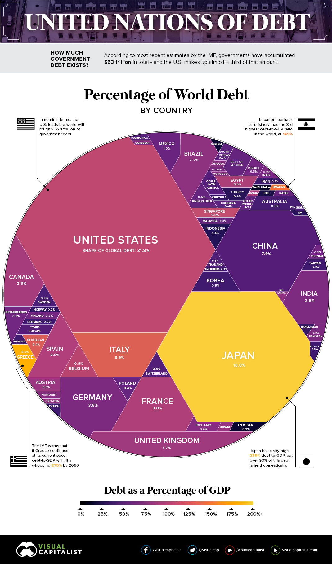
Visual Capitalist's example shows how infographics can be used to take the findings of an in-depth and mostly dull report about the world's global debt and make them much more engaging. By doing this, it's not just making it more interesting for people who would probably read the whole report but it's also extending the reach. The user-friendly design means anyone can see and understand the information set out, without any background in finance or economics.

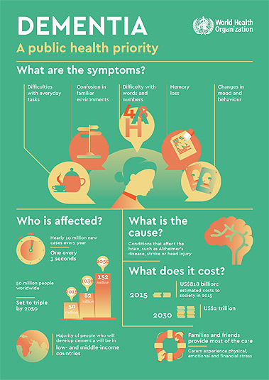
This infographic from the World Health Organization takes a complicated issue like dementia and breaks it down into bitesize pieces of information that help readers better understand the topic.

3. Parallax scrolls
Parallax scrolls are a combination of quizzes and infographics, taking the interactiveness of the former and putting it with the visually-appealing design of the latter. This technique encourages visitors to scroll down a webpage to get new information and can be used in a variety of ways.
German company Herzblut & Bock uses parallax scroll to transform the traditional 'About Us' landing page into something more memorable and engaging to visitors, similar to this example from Brazil-based firm Garden Estudio.
Crowdfunding site KickStarter breaks down its annual report into something that draws users in but goes one step further to highlight the products it made possible and the community element of its company.
4. Graphics
Slack uses graphics to boost the engageability and design of its main landing page but there are many other ways that graphics can help boost boring or dry subject material. Images are processed by the brain faster and so can make it easier to draw visitors in and communicate information. This means they're a great option for whitepapers and ebooks, where you want viewers to learn something or focus on a key takeaway.
Graphics are great because they are one of the most versatile elements, so you can use them in pretty much every area of your content marketing strategy. From using them to bring personality to your About Us page to highlighting key bits of information in your thought leadership content, they are incredibly effective tools to use.
Access the latest business knowledge in Marketing
Get Access


Comments
Join the conversation...