A well-received piece of interactive content that hits the mark with your audience is hard to match for performance. Here are five of our favorite interactive experiences from the last few years:
The Conjuring 2 360 VR Experience Trailer (2016)
You’d be forgiven for thinking YouTube’s 360 video format was tailor made for jump scare horror film trailers like The Conjuring 2. There have been many attempts at using this feature for horror trailers in the last few years, but few have matched the experience offered here, which provides genuinely immersive ‘head turning’ visuals delivered at a comfortable pace with an especially eerie soundscape.
Despite all the steps taken to ensure there’s plenty to look at, and that users generally orientate their view in the right direction, it’s still easy to miss some of the subtle details and origins of the strange sounds while you investigate a haunted council house in Enfield, England. Re-watches are encouraged... if you dare.
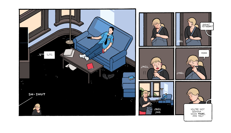
iPad comic Touch Sensitive by Chris Ware (2011)
This is one of the older interactive experiences on our list, but non-linear graphic novelist Chris Ware’s masterpiece still stands out as one of the best examples of how to make use of touchscreen technology in narrative storytelling. Touch Sensitive features some fantastic UI design by game studio Spaces of Play that, when combined with Ware’s ability to draw and guide the readers’ eye through his drawings, makes the pinches, swipes and taps feel as natural as using a door handle.

From the man who brought us the heartfelt Jimmy Corrigan, the Smartest Kid on Earth and the more recent Building Stories, Ware delivers yet another uncannily ordinary story about a normal person that provides plenty of lessons for marketers in interactive storytelling.
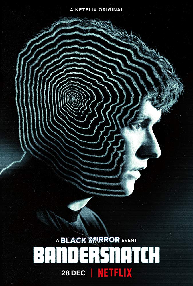
Black Mirror: Bandersnatch by Netflix/Charlie Brooker (2018)
Many attempts have been made to replicate the unputdownable qualities of teenage choose-your-own-adventure books, but few have managed to match the narrative variation achieved by the original. Black Mirror’s latest Netflix creation divided critics, but few can dispute how much effort had been put into devising a complex and intense story. Two aspects of Bandersnatch are particularly impressive:
- Narrative variations - the sheer number of choices you are required to make throughout this interactive experience is phenomenal. While it proved too much for some, the combination of standout performances and teasing visual cues left just enough curiosities in every scene to encourage replays with different choices.
- Cross-device functionality - you’d expect nothing less than a seamless interactive experience from Netflix, but it is nonetheless important to acknowledge the pretty significant adaptations the online video platform made to its interface to enable Bandersnatch to be experienced on pretty much any Netflix-compatible device, from remote controller-controlled smart TVs through to touchscreen mobile phones.

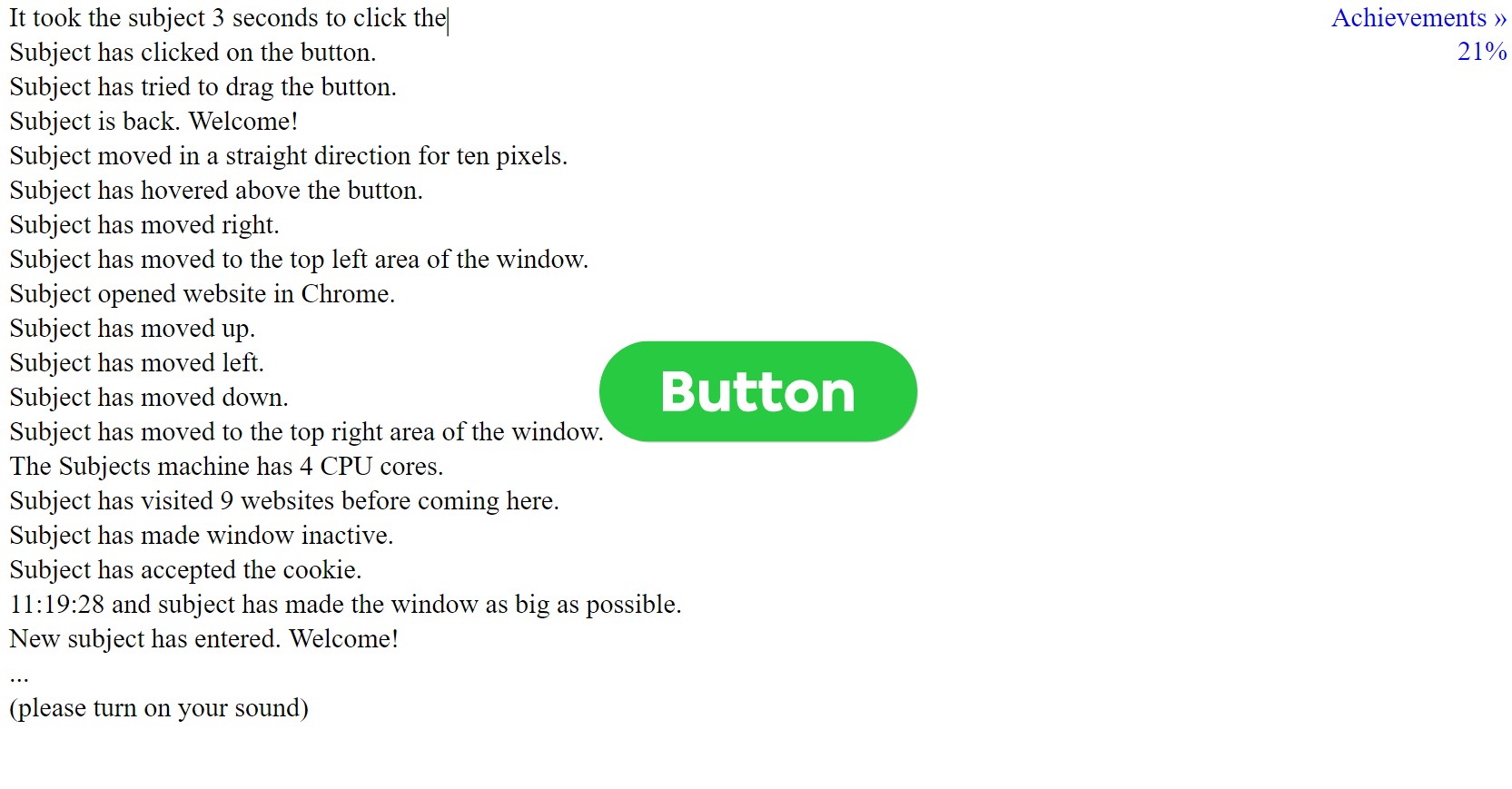
Clickclickclick.click - real time user tracking
The website clickclickclick.click has no doubt become a staple of geek-offs between data scientists and digital analysts the world over. This simple website describes in text and audio every single interaction users have with it, in real time.

It’s an entertaining website that you’re guaranteed to spend longer playing with than you expect, but it is also a creepy reminder to the uninitiated of just how much can be tracked and monitored about your behavior, and features of your device’s hardware by sophisticated website tracking.
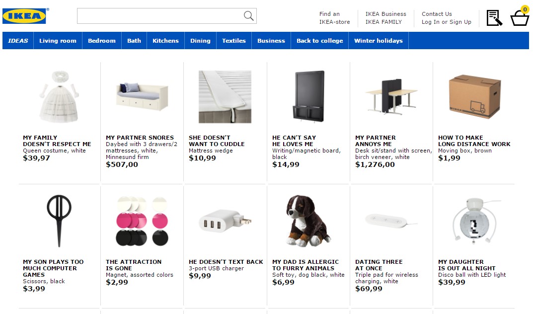
Ikea Retail Therapy SEO campaign (2016)
The wildcard on our list, Ikea’s Retail Therapy SEO campaign stands out for its elaborate and somewhat surreptitious attempt at user immersion. Back in 2016, Ikea created a duplicate of its main ecommerce website with one key difference: all listed products were renamed as relationship problems that are commonly queried by search engine users. The campaign was executed so well by Ikea’s digital marketing team that, in addition to Ikea products showing up as paid search ads in SERPs, campaign pages also started showing up in organic search results for relationship problems as well.
Like all the examples on our list, and all good interactive content experiences for that matter, Ikea was careful to ensure that their interactive content was also entertaining, thought-provoking and done in sufficient depth to enable the curious to explore for longer than a few fleeting seconds.

To make better decisions with your marketing strategy, you need to keep up to date with industry trends. To view more, click here.
Access the latest business knowledge in Marketing
Get Access


Comments
Join the conversation...