This article will explore some essential guidelines for creating a killer visual presence online.
1. Who do you want to be?
Defining who you want to be, that is, what you want to accomplish with your brand and how you want it to be perceived, will point you in the right direction regarding your visual marketing. Try asking yourself some of the following questions:
- What are your goals and objectives?
- What is your brand’s ultimate mission?
- What are your core values?
- What is it about your brand that makes it different?
Answering these questions will help you develop a clear picture of your brand and become exactly who you set out to be.
2. Who are you trying to reach?
Knowing your target audience and their preferences, interests, and needs will help you create visuals that they will find interesting. Conduct audience research and find out what makes them tick so you can create eye-catching visuals that will grab their attention and compel them to check out what you have to offer.
3. Start with the logo
Your logo will be your brand’s identity, so you need to create one that will perfectly represent everything that your brand stands for. Design a logo that resonates with your brand strategy and creates a long-lasting impression in the minds of your audience.
Don’t copy someone else but create a logo that is unique and speaks volumes about your brand. Come up with something simple, memorable and easily recognizable. You could even set up a logo design contest and get a few designers involved to provide you with a variety of options to choose from.
4. Go on to the color scheme
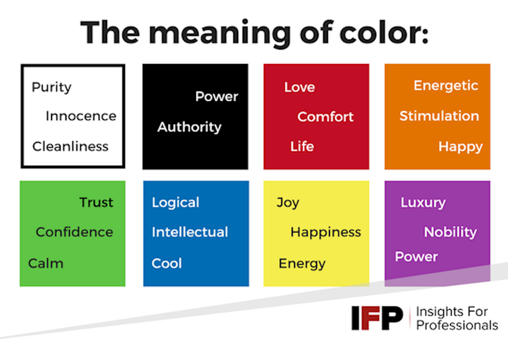
You need to be careful when choosing the right color palette, not only for your logo but also for your marketing collateral, such as catalogues and brochures. Find the color scheme that will evoke positive emotions and that will match the overall tone of your brand.

5. Logo and color scheme are the basis for website design
Your logo and color scheme will define your website, as they will be the first things that people notice. They are the fundamental elements for creating a visual presence, so make sure that they match and are actually pleasant to look at.
For instance, people don’t enjoy colors that are too bright to look at, but that doesn’t mean you shouldn’t use bold colors. Strike a balance and pick something that draws attention but makes content visible and easily readable.
6. Keep things consistent
Consistency is key to a stunning online visual presence. Everything you publish or share directly with your target audience should be consistent. This not only paints a professional picture, but it allows for individuals to clearly know who you are and it helps to build trust and brand loyalty.
Content
Every blog post must have a consistent tone so that your readers will instantly recognize your brand’s unique voice. All the images, infographics and videos you include in your content should also be consistent with your brand, having the same style and conveying the same unique brand message.
Social media
Whatever visuals you include in blog posts, share the same visuals alongside those posts on social media. Remember to regularly communicate with your followers and make your social profiles reflect your website and blog.
Newsletter
Just like your blog posts, make sure that every email you send has the same tone so that your recipients can easily recognize you and instantly hear your voice.
Other media
No matter what other media you use to create an online presence, remember to let your brand image shine through, just like with your social posts, emails and blog posts.
7. Design templates to keep everyone on the same page
Using design templates will help your team maintain the necessary consistency across all your messaging since everyone will know exactly which guidelines to follow. Everyone will be able to ensure they are perfectly aligned with one another and with your goals.
8. Make sure you use the right platforms
Instead of wasting your efforts, utilize platforms that your target audience prefers to use. Have in mind that Facebook remains the dominant platform for every type of content, but Instagram and Pinterest are the best platforms for visuals. If you plan on sharing videos, think about creating a presence on YouTube as well.
9. Keep the content coming
The key to a strong visual presence is to provide fresh content regularly, so continually work on coming up with something new that helps you stand out. Schedule weekly brainstorming sessions, motivate your team and help them spark their creativity. Keeping the content coming will keep your audience interested and make them look forward to your new releases.
Access the latest business knowledge in Marketing
Get Access


Comments
Join the conversation...