The fundamental purpose of advertising is to get someone's attention and encourage them to do something. To visit, to buy, to do, whatever it is that your company offers. But what is the best way to get someone's attention? To stand out of course.
Since the 1830s in New York, billboards have been standing out like no other form of advertising. They're a staple of advertising and have even enjoyed some celebrity status in the recent film Three Billboards Outside Ebbing, Missouri.
So why not look into getting a billboard out there for your own firm? In this article, we look at the effectiveness of such a decision.
How billboards make a statement
In the UK, people are ‘out and about’ for around three hours and ten minutes every day, with 16 minutes spent looking at adverts, according to Route. Why not target your consumer during this window of opportunity with a large, high quality, well-located billboard in a place with high footfall or traffic?
Where brochures need multiple pages designing, billboards only need one! Need something effective up and running in a hurry? A billboard is a single page of design, which should save you time when putting together a template that will offer maximum ROI.
Have you heard of the ‘Marketing Rule of 7’? This theory claims that a consumer must hear or see an advertising message at least seven times before taking action. By placing an outdoor banner in a public place where people will pass every day or a few times a day — like on the way to work or when dropping off and picking up their kids from school — you can help hit this number and potentially increase your brand’s chances of a conversion.
Billboards have a great potential to reach a huge audience. So, how do you make sure your billboards are as effective as possible?
How to design a great billboard
Your ad design needs to catch the eye. However, if your billboard will be placed at the side of a high-speed road, this creates an even greater demand for noticeability. Think strategically about what you want on your billboard — someone driving past at 40mph+ is only going to be able to take in so much. Ask yourself the following:
- What is your marketing objective?
- Do you want to sell a specific product?
- Are you spreading brand awareness?
- Promoting an event?
Determine exactly what you want to achieve from your advertisement and provide only the essential information — like contact number, name of product or date and location of event.
Think about the imagery and how the billboard will look
A billboard is perfect to show off a big, conceptual image. According to research, people generally only recall 10% of information they hear three days later. However, using a relevant image alongside this information increases retention by 55%.
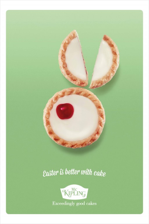
When designing your billboard, try and think of a funny or quirky image that will grab and hold the attention of a passer-by — such as cake brand, Mr Kipling’s, clever and unusual image of a bunny made using only Cherry Bakewell cakes as part of its Easter marketing campaign.
Due to the size of a billboard, your images can pack a more powerful punch, so focus on getting the image perfect and then build your design from there.
Focus on clarity when it comes to your billboard design. Utilize bright and bold colors to catch the eye — contrasting colors reportedly stay in people’s memories for longer, too — and opt for a simple background and large, readable text — Sans Serif is always a good option.
Where will the advert appear?
Is your billboard going to be located at the roadside?
A driver typically has five to ten seconds to view an ad, which means you need to consider copy length. The more relevant and informative your image is, the less you should need to convey with text — stick to a brief, punchy message of seven words and you should get your marketing message across, no problem.
Pick a location that suits your ideal target audience. For example, if your products are for 18-21-years-olds, find a site near a university or college. Otherwise, you could reduce your ROI due to not being in sight of the people who are most likely to engage and act on your ad.
Inject a sense of humor
Boost your local connections; if your billboard is being placed locally, make a reference locals will get! Include an image of a local landmark to create a sense of familiarity or reference the local traffic in a funny way. Humor generally works in advertising. According to a review of 6,500 ads, the funniest were usually cited as being the most appealing and memorable. What’s more, adopting this personal and familiar approach creates a sense of friendliness, so you’ll also exude a more welcoming brand persona.
Access the latest business knowledge in Marketing
Get Access


Comments
Join the conversation...