A logo might seem like a small symbol, but it serves as your most crucial branding asset to recognize you in the crowded market. In this era, where people have shorter attention spans, a timeless logo gives you the opportunity to sustain your relationship with customers in the most effective way possible.
Your logo is your visual identifier, which promotes your brand and recalls your identity in the minds of your target audience when they see it. Therefore, your logo is a symbol with unlimited potential to uplift and sustain your brand’s image. In other words, it's your company’s first impression, and one that is meant to create an impact.
There’s more to crafting a brand’s visual identifier than just putting a symbol into a circle, filling it with a nice random color and calling it a day. More often than not your logo is at times even more identifiable than the brand name itself. This accurately explains why you need to put your utmost effort into the logo design process including your artistic vision, creative thinking, and strategic planning.
If you want your logo to be impactful for the years to come, then it has to be timeless and memorable so a brand can grow around it without necessitating a design overhaul. This article is going to walk you through all the essential components that will help you to create the perfect logo.
1. Opt for simplicity over intricacy
Logo design isn't something you can add random details into because you think it looks pretty. You need to keep the core brand values in mind; only then you will know what to keep and what to skip.
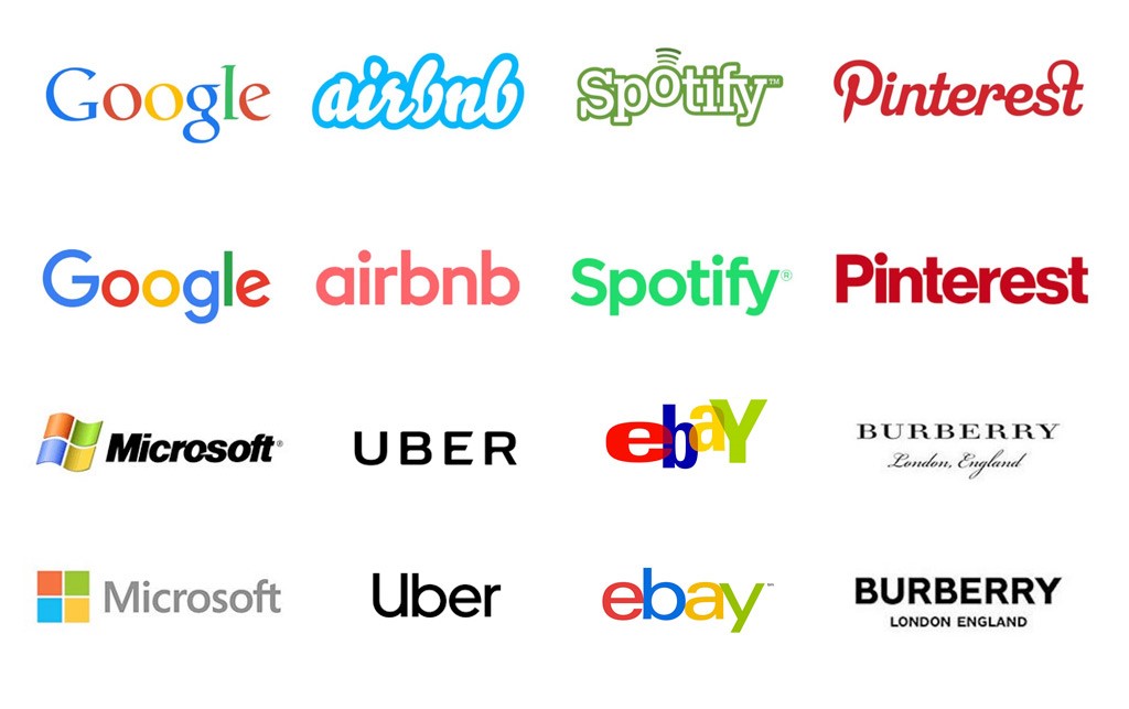
It might be difficult to resist the temptation of adding intricate details. However, it’s important to not incorporate anything unnecessary in the design. Keep it clean, crisp and captivating. Needless to say, the more intricate the design, the faster it will date. Bear in mind that simple is the new smart. According to the K.I.S.S design principle, only a simple and straightforward logo can make your brand image to stand out from the crowd.
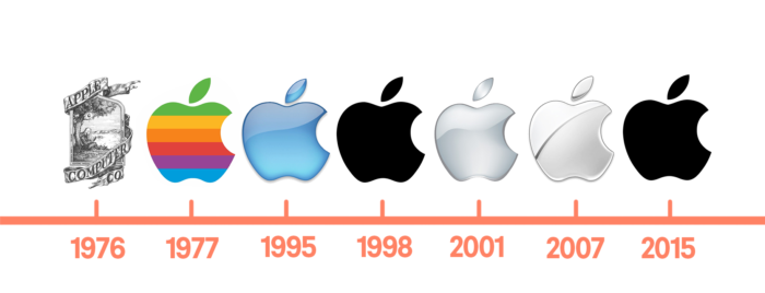
Take a look at Apple’s logo history. Their first ever logo was filled with unnecessary details; within a year they’d decided to do a design overhaul. The result? Their iconic logo which people around the world recognize and is still considered as one of the most timeless logos of all time.
 Source: 99designs
2. Versatility is key
If you think you’re all set to embark on your logo design journey, take a pause and re-evaluate your design to ensure it’s capable of looking good across all the channels in which it will appear, this includes branding collaterals, billboards and social networks, not just your website and/or storefront. Irrespective of the size, whether it’s blown up on a huge billboard or appearing tiny in a letterhead, your logo should look impeccable no matter where it’s going to be placed.
3. Keep the colors limited
Colors appeal to the human senses. Who doesn’t like color? However, when it comes to logo design, this task is a bit more sensitive. You can’t simply merge random colors because you like it them.
There’s a comprehensive science behind color selection. As your color palette is one of the most critical considerations for your logo design process, it’s always suggested that you should stick to a small palette including the primary colors of the brand. It’s also worth being mindful of color psychology so that you understand the meaning that will be expressed to your target audience.
Remember, colors can make or break your brand message, so be cautious when picking your palette. Take the McDonald’s logo as inspiration; you can tell just by looking at the corner of the billboard that it belongs to the renowned fast food brand. And this is because of their eye-catching yet straightforward color scheme.
 Source: Adweek
4. Don’t stuff fonts into the design
Similar to colors and other logo design elements, font selection is another aspect to consider before you commit to the logo design process. Each typeface has a different mood and nature; thus they denote a completely different and unique meaning. You need to be mindful of the nature of typeface before adding it into your design. Make sure that it goes perfectly well with the theme and colors.
Do not use multiple fonts that belong to a different family or else you will hurt the message it’s supposed to deliver. Focus on your typographic creativity, and avoid unnecessary effects like bold and semi-bold as they can affect the personality of the typeface. Keep your logo classy with the crisp and relevant fonts and, lastly, steer clear of decorative fonts unless you really need it.
 Source: Waddup
5. Make it social media friendly
If you really want your logo to be effective, you need to keep it as social media friendly as possible. In today’s era when all brands are on social media almost all vying for the same eyeballs, there’s an equal opportunity for brands big or small to attract a fair share of the audience.
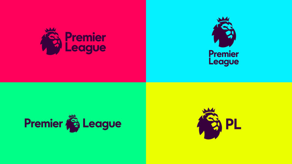
Keep your logo flexible and adjustable for social media. If possible, create a dedicated version for your social accounts which is not only minimal but customized thoughtfully. Here’s a great example on how to remain flexible:
 Source: SBN
In conclusion
Crafting a timeless logo is not an overnight task. Everything needs to be selected carefully, for which you have to go through intense brainstorming and rigorous research. Remember that the logo you are designing is meant to be targeted towards a particular audience, therefore, keep their preferences in mind and come up with a logo that is simple, minimal, adjustable and unique.
Access the latest business knowledge in Marketing
Get Access


Comments
Join the conversation...