In 2018, it became 100 years since World War I ended. From 1914 to 1918, this conflict embroiled most of Europe — along with Russia, the US and the Middle East — and is considered one of the bloodiest ever, with approximately 35 million casualties.
Many people, from all backgrounds, united together to contribute to the war effort. And they all contributed in different ways — from fighting on the frontline to working in munitions factories. But with communications far less efficient and slower than what we know today, advertisements became an essential component of mobilizing morale and letting everyone know how they could help.
Where The Trade Buys, a UK-based banner printing company, have compiled some of the most iconic World War I posters, including how they did - or didn’t – work. See if you know any…
1. Air raid shelter warning
It was important to authorities that the public knew how to protect themselves throughout the bombings of World War I. As you can imagine, this was a new concept and there were many of these temporary places of safety all over cities. Up to 300,000 people used underground stations from 1915 onwards.
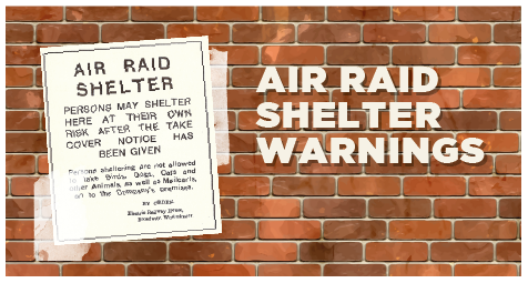
These posters below were placed in or at the entry points of air raid shelters to make it clear where these sanctuaries were — and what you could take in with you.
Why was it effective?
The poster had one main purpose; to encourage people to get to protection during an air raid. Using different-sized fonts, it separates each piece of information into level of importance: the first being that the location is a place for shelter, the second that any injury here is not the fault of anyone but the wounded person, and the last that certain creatures and objects are forbidden.
Following the posters, statistics show that around double the number of people used tube stations to shelter from bombings between May 1917 and May 1918 than during The Blitz attacks of 1940.
2. Keep calm and carry on
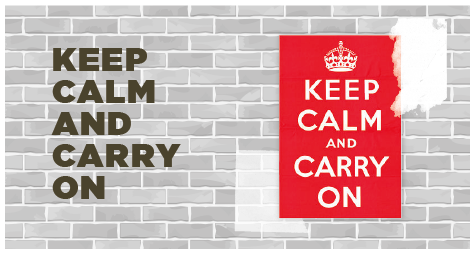
This is a slogan that many of us recognize today, despite it not being too successful when it was released. It was part of a motivational campaign — which included ads launched by the government in 1939 featuring the slogans:
The punchy phrase and crown image were designed to quell hysteria and instill a collective feeling of togetherness, community spirit, and, most importantly, ‘Britishness’ to help people cope with the tragedies of war.
Why was it effective?
In fact, this poster wasn’t effective. Around 2.45 million posters for this campaign were printed, yet ‘Keep calm and carry on’ was never authorized for display and the other two designs had a very limited showing before being scrapped. But why?
It was discovered that people who had seen the slogan had an issue with it. They said that they found them patronizing, ambiguous and inappropriate. They were designed under the misconception that the nation would be hit by numerous bombings, resulting in massive destruction and countless casualties immediately following the declaration of war. So, when war was declared, and this didn’t happen, these dramatic mottos just didn’t make much sense. Many also interpreted the ‘your courage will bring us victory’ as soldiers and the general public must make sacrifices on behalf of the upper classes and high-ranking army officials, which added to their lack of appeal.
In 2000, one of the original posters were discovered in Alnwick. And, ever since, the saying has been reused on mugs, pens, t-shirts and other merchandise!
3. Britons join your country’s army
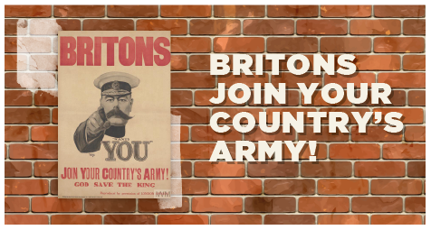
This poster was designed by Alfred Leete. It features the British Secretary of State for War, Lord Kitchener, pointing at the reader above the slogan ‘wants you’. At the time, Lord Horatio Kitchener was a well-known and very respected military leader and statesman to the public — an opinion not necessarily shared by all of his cabinet peers.
This image was an effective choice, though. The government were able to encourage millions of men to enlist, and reportedly, there was a significant spike in volunteers putting themselves forward to join the army immediately after the poster’s launch in September 1914.
Why was it effective?
The emboldened ‘BRITONS’ text and insertion of ‘God save the king’ were hugely influential in inspiring patriotism, while the image of the pointing Lord Kitchener made the poster seem personal to each viewer. The call-to-action — ‘Join your country’s army!’ — is also clear and concise, while the use of red is an excellent choice to grab attention.
This poster came at a time when it was critical that that men took immediate action and enlisted to fight, and this urgency is clear from its strong, stirring and succinct design.
4. Dig for Victory
If people heard the slogan ‘dig for victory’ today, many would associate it with World War II and the push for homegrown produce among this time. During the 1939-1945 conflict, feeding those left at home became a great concern and something needed to be done to reduce the country’s reliance on imported produce.
This poster was released around one month before World War II broke out. The Ministry of Agriculture launched the poster to encourage the public to grow their own food to ease the pressure on rationing. This campaign was international, with ‘victory gardens’ proving just as popular in countries like Canada, Australia and the US.

Why was it effective?
Research has shown that urban areas became transformed wherever possible, with many parks, sports fields and back gardens used in cities as makeshift allotments. Even the lawn next to the Tower of London was used to grow vegetables!
A lot of people believe that the success of this poster was down to its simplicity. The slogan ‘Dig for victory’ has all the tools to inspire a response: a simple action (dig) to secure an essential outcome (victory). Utilizing the eye-catching quality of bold red and a simple close-up of a ‘Brit at work’, the poster grabs the viewer’s attention and implants a sense of ‘taking action’ to make a difference. Reportedly, the number of allotments across the country reached around 1.75 million following the launch of the ‘Dig for victory’!
5. The Women’s Land Army (WLA)
Many of the recognizable and famous memorabilia from the wartime came from the Women’s Land Army. By the end of the first year of World War I, more than one million men had been recruited to the British Army — a number that hit around five million by the end of the conflict. As a result, the country was suffering from a significant workforce shortage and needed to employ the help of women to feed the people left at home.
Why was it effective?
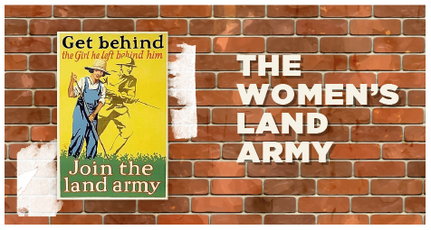
The main target of the poster was to persuade young women to take over jobs in agriculture. Often referred to as ‘Land Girls’, some farmers were hesitant or even completely against using female workers, despite the dire situation. Others even felt that the choice of WLA uniform was too masculine.
What made it so successful, though? To someone who was deemed unsuitable to participate in front-line combat for her country and who perhaps wanted to break free of the domesticated lifestyle and dress code that she was compelled to follow, this image of a woman dressed in loose dungarees and working in a field showed that this was the time to prove how equally capable female manual laborers were to their male counterparts. Just two years after its launch in 1915, there were over a quarter of a million women working on British farms, with approximately 23,000 in the Women’s Land Army.
6. Are you in this?
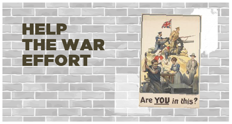
The ‘Are you in this’ poster was created by Robert Baden Powell in 1915. It features a mix of people carrying out various war-related jobs, with the slogan ‘Are you in this?’.
What the poster does is encourage you to evaluate your personal war effort — are you helping the wounded, working in munitions, building vital machinery, fighting in the armed forces, or simply strolling around with your hands in your pockets?
Why was it effective?
This poster is a great example of marketing material that uses pictures to speak a thousand words. In marketing, you have a very small timeframe to make an impact — and a strong image that tells a story can sometimes help you achieve that quicker than text.
The imagery spoke directly to all viewers — for example, it’s not gender-specific. The use of multiple war roles helps to widen the scope of potential jobs that someone who is not ‘doing their duty’ could be doing, if they took action. Relegated to the edge of the poster with his hands idly in his pockets, few viewers would feel a positive connection with the man who is not contributing.
Access the latest business knowledge in Marketing
Get Access

Comments
Join the conversation...